Is Earth warming
up or not?
But the Earth is warming up, you say. Well, the evidence
for that is very skimpy and is, due to the poor quality of surface
temperature recordings, not supported by an overwhelming quantity and
quality of facts. Moreover, what we can consider to be normal at any
given time depends on the time interval into which a given point in time
falls.
The climate alarmists do not tell us that for the years following the
"high" temperatures reached in 1998 the global average annual
temperatures reached were in every single year below the "high" reached
in 1998 and appear to have begun a downward trend.
Many surface temperature measurements that are being tracked and reported are being taken and recorded in or near large urban centres. It would be no more accurate to extrapolate from them to the rest of the
World than it would be to extrapolate from the reading in my kitchen right now and to
conclude that we really and truly don't have now [in 2003] the coldest spring we've had for the last
150 years, ever since temperatures were recorded more or less on a global basis.
And that is where the problem lies. We don't have a sufficiently accurate record
of surface-air-temperature readings to tell us
what our climate has been in this region, or in North America, or for that matter
in the
whole World, to tell us what normal is. What we know is that "normal" is
the average of a whole range of values. What we don't know is what the whole range
of values is and how far away from or how close to normal we are right now, or do we?
Whatever the length of the interval, whether it
covers the last 12 thousand, 450 thousand, 5 million, 65 million or 500
million years, global average temperatures have been
falling steadily.
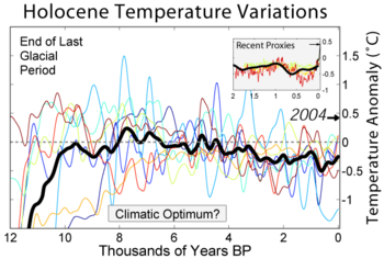 The annual global average temperatures are
now considerably lower than they were many times in the past. The annual global average temperatures are
now considerably lower than they were many times in the past.
The
rising global temperature trend that excites the climate alarmists
covers only the last 100 years or so since we came out of the Little Ice
Age. Most of the warming that occurred during that interval
occurred during the first 44 years of the last century, prior to the
explosive, post-war growth of industry, traffic and transportation.
The global temperature saw a decline during the following years and
reached the "high" temperatures experienced in 1944 not again until
1981. The "alarming" warming that gets the climate alarmists'
knickers into knots happened during the interval from the mid-1940s to
1998, even though in the longer temperature trend that warming trend is
only a mere, almost-imperceptible blip and means nothing other than that global temperatures were
many times in the recent and not-so-recent past considerably higher.
Systematic surface-air-temperature recordings were not taken everywhere or universally for more
than about 150 years, and even at that, not even in the whole world, only in some portions
of it.4 No doubt, as the Fraser
Institute's Guide to the Science of Global Warming identifies, "The
historical surface and proxy records suggest that temperatures rose about 0.5°C in the
early twentieth century—before most of the greenhouse gases were added to the air by
human activities."5 It must be
stressed that the global temperatures didn't increase after the explosive
growth of industry
following W.W. II.
There are ways to infer from other evidence what the climatological record
was, going back for quite a long time, thousands of years.6
A surface temperature record, containing recordings from many weather stations
around the world (the vast majority of them no longer operating, such as many in the Canadian Arctic),
is available at the website of the Goddard Institute for Space Sciences.7
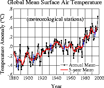
Source:
GISS
Consider also the explanation offered by the Goddard Institute for Space
Studies following that graph:
Global Surface
Air Temperature is based on surface air measurements at meteorological stations.
Click for temperature maps and more detailed data. Since corresponding data are
unavailable over the ocean, surface air temperature anomalies are combined with ocean
temperature anomalies to obtain a 'Land-Ocean Temperature Index'.
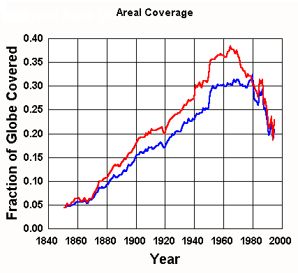
That is not the only problem afflicting the data reflected in the graph.
A major issue of concern is that the total number of land-based weather stations
declined over time. Not only that, but an increasingly disproportionate number of
the weather stations remaining in operation are located in urban and not in rural
areas. The following graph shows an example of what these differences are.
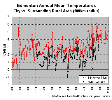
Keep in mind that although these differences are well known and
corrections have ostensibly been made to take them into account, the GISS data base used
in the calculations of global warming trends nevertheless contains them. The results
of the calculation of regional and global averages are therefore tainted by the presence
of the bias introduced through the heat-island effect.
However, consider also that even though airports are in the open, they do
have large areas of paved runways that store day-time heat which they release slowly
during the night. I don't know where the temperature gauges for the Edmonton
International Airport are located in relation to the runways, but the airport buildings
are at the SE end of the expanse of the runways.
The calculations done by General Circulation Models (GCMs) are
the main source of the information that fuels the global warming hysteria.
Nevertheless, not one of them comes acceptably close to accurately calculating
what the climate presently is at any location, let alone of the whole Earth.
Not only that, but all of the GCMs differ widely from one another as to what the
climate was in the past, and as to what it is supposed to be in the future.
Therein lies the problem. No one in his right mind will base any decisions
about the future on tools that cannot determine with acceptable accuracy what
the present is and the past was.
Update 2009 12 11:
The GISS temperature record can no longer be
trusted.
On or around about Nov. 14, 2009, GISS began to use a
new global temperature data set that deleted temperature records relating to
the late 19th and early 20th centuries. Not only that, but the
temperature data that remained in use were adjusted downward for dates
preceding the year 2000 (increasingly downward the farther back in the
temperature record they go), thereby creating or exaggerating "warming"
trends for individual locations.
A discussion thread at
http://wattsupwiththat.com details the nature of the data fiddling.
From that discussion thread:
...See under “What’s New”:
http://data.giss.nasa.gov/gistemp/graphs/
“Nov. 14, 2009: USHCN_V2 is now used rather than the older
version 1. The only visible effect is a slight increase of the US
trend after year 2000 due to the fact that NOAA extended the TOBS
and other adjustment to those years.
Sep. 11, 2009: NOAA NCDC provided an updated file on Sept. 9 of the
GHCN data used in our analysis. The new file has increased data
quality checks in the tropics. Beginning Sept. 11 the GISS analysis
uses the new NOAA data set. ”
The "visible effect" of the new, manipulated data set is far greater than
the quoted note implies. The data changes were without a doubt
manufactured to create a warming trend where none exists or to exaggerate
possibly existing warming trends.
This is not the first time that the gate keepers of climate data were caught
in the act of large-scale falsifying of existing data.
Temperatures at our farm (the thermometer probe is located at the
north side of the house, about 2.40 m above ground and about 0.75m away from the house)
are on average about 3°C lower than the readings taken at the Edmonton International
Airport. Our house is located about 70 miles to the NE of the airport. Here is
an illustration of the differences between temperatures reported at some locations in the
Edmonton area.
Temperatures (°C) in Edmonton and nearby
locations
January 14, 2003 |
| Time |
Our Farm NW2-57-20-W4
2 miles east and 6.5 miles north of Bruderheim |
Bruderheim1 |
Chipman1 |
Lamont1 |
Edmonton International Airport2 |
| 05:00 |
-24.3 |
-20 |
-20 |
-20 |
-23 |
| 06:00 |
-27.7 |
-19 |
-19 |
-19 |
-23 |
| 07:00 |
-26.4 |
-19 |
-19 |
-19 |
-23 |
| 08:00 |
-24.7 |
-19 |
-19 |
-19 |
-19 |
| 09:00 |
-23.5 |
-19 |
-19 |
-19 |
-20 |
| 10:00 |
-22.1 |
-18 |
-18 |
-18 |
-18 |
| 11:00 |
-22.0 |
-17 |
-17 |
-17 |
-18 |
| 12:00 |
-20.3 |
-16 |
-16 |
-16 |
-18 |
| 13:00 |
-19.5 |
n.a.3 |
n.a.3 |
n.a.3 |
-17 |
| 14:00 |
-19.1 |
-15 |
-15 |
-15 |
-17 |
Sources: Manual readings taken at
our farm; The Weather Network for the remaining locations:
Bruderheim, Lamont and Chipman,
Edmonton
International AirportNotes:
1.) It appears doubtful that the temperature readings were
from Bruderheim, Lamont and Chipman. It is not likely that temperatures in those
three locations could have been identical for the identified times. Moreover,
it is extremely unlikely that the temperatures for Bruderheim, Lamont and Chipman can
possibly be higher than those in Edmonton. All three locations are small rural towns
located some distance east of Edmonton, in an area that is generally a few degrees colder
than Edmonton.
2.) It is doubtful that the figures shown for the
Edmonton International Airport stem from readings that were taken at hourly intervals,
although the data taken from The Weather Network clearly identified that they were taken
at the times shown in the table.
3.) The Weather Network did not show a temperature reading
for 13:00 hrs at the location.
|
If temperature readings taken in a technologically advanced
nation are unlikely to be accurate and instead probably fictitious or at best interpolated
with a dubious degree of accuracy, what conclusions is one to draw for readings taken in
underdeveloped nations?
For a discussion of the problems faced in determining correct assessments
of surface temperatures and their averages even for individual locations, refer to the
following:
By GISS
Aside from the design- and human errors that may and do creep in when
setting up instrumentation and taking readings, the readings are affected by the heat
island effect generated in urban areas. The heat-island effect is substantial,
measurable in communities of 250 or more residents, increasing over time
as energy consumption and population density increase, and
cannot be ignored. Determining accurate correction factors for individual
areas in which temperature readings are taken in uncharacteristic hot-spots becomes
difficult and even impossible if no corresponding records of readings exist for the
surrounding rural areas, and as more and more weather stations in rural areas are being taken
out of service.

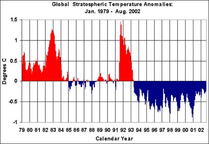
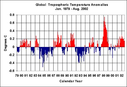
However, for a number of years now, temperature measurements have
been made via balloons and, in an even more thorough and comprehensive fashion, via
satellites. The records established by those means show no or at worst only almost
imperceptible global warming. Of course, those records are unbiased by human error
and undistorted by the fact that temperature readings taken in urban areas are affected by
the heat-island effects of the cities in which many are taken and that taint the results
of global averaging of global temperature records.
Measuring the
Temperature of Earth From Space
Even with Needed Corrections, Data
Still Don't Show the Expected Signature of Global Warming
By Dr. Roy Spencer
Senior Scientist for Climate Studies
NASA/Marshall Space Flight Center
14 August 1998
Full
Story
|


